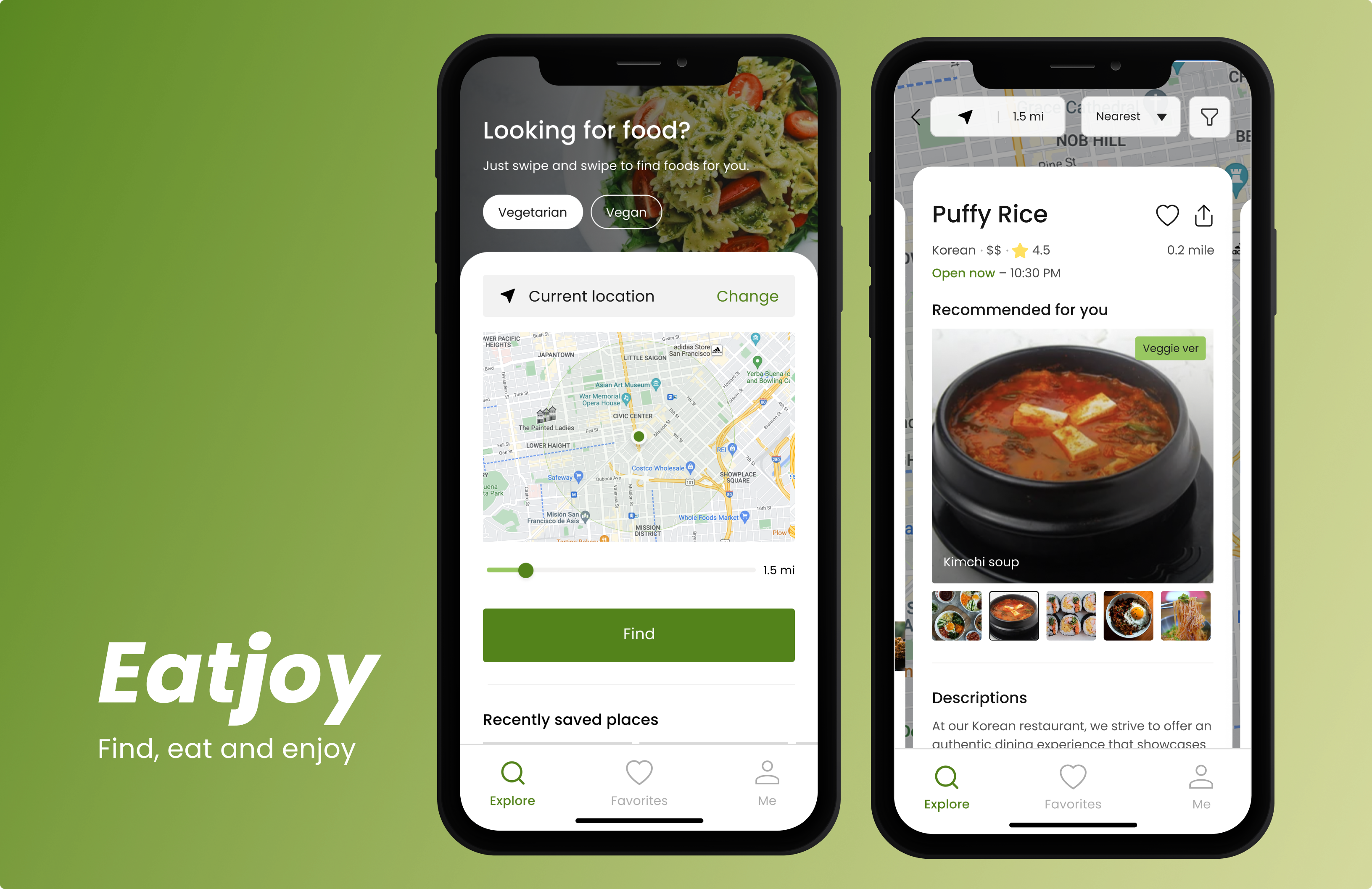
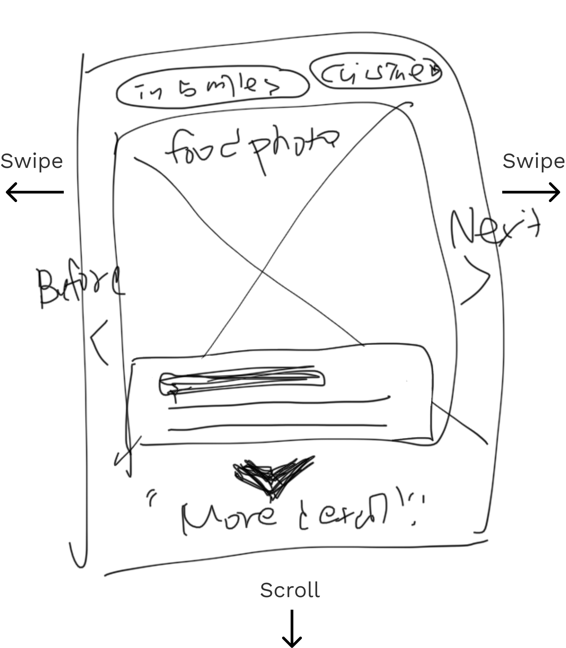
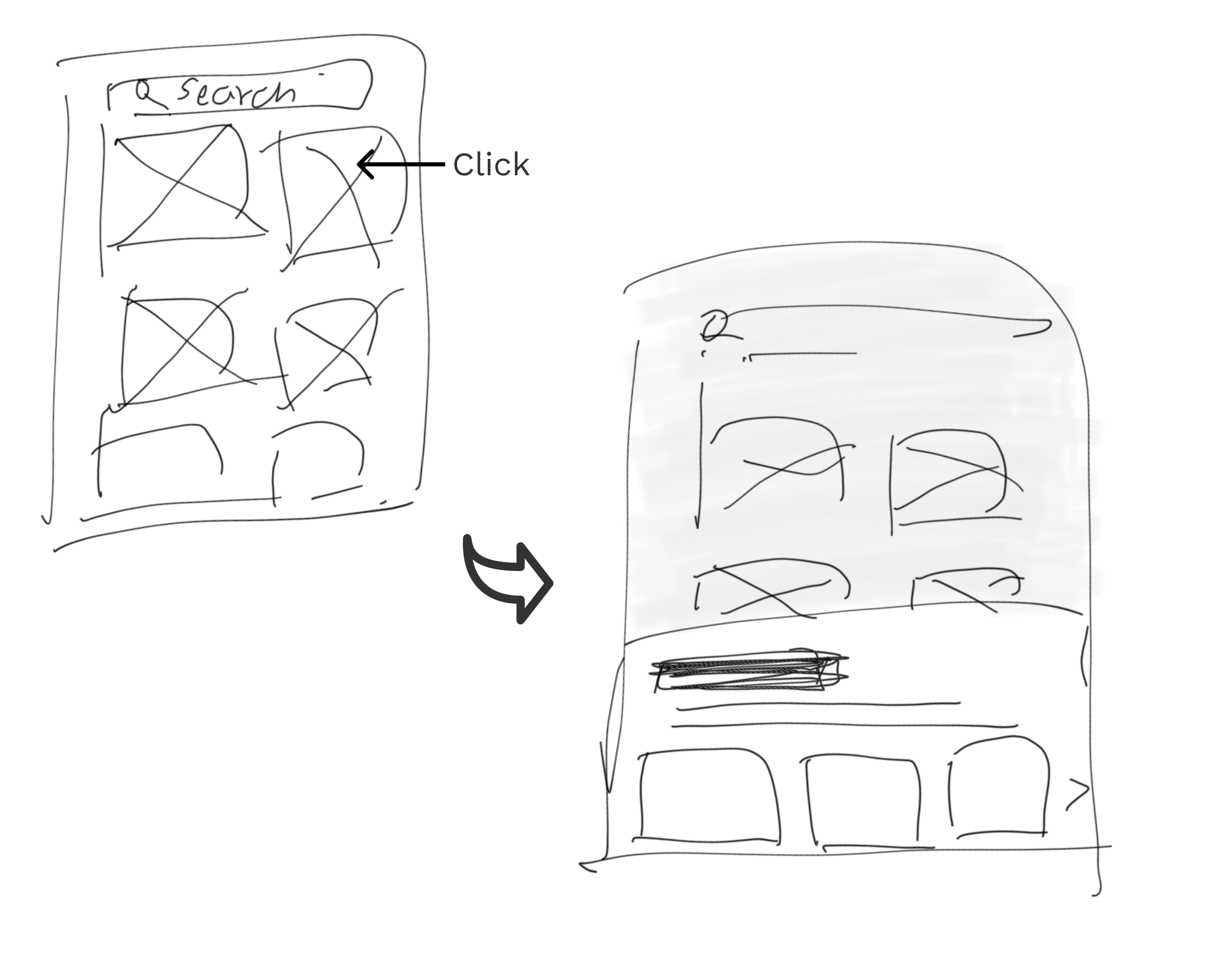
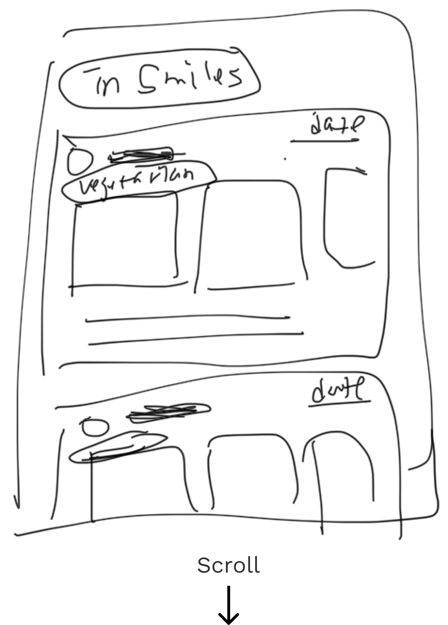
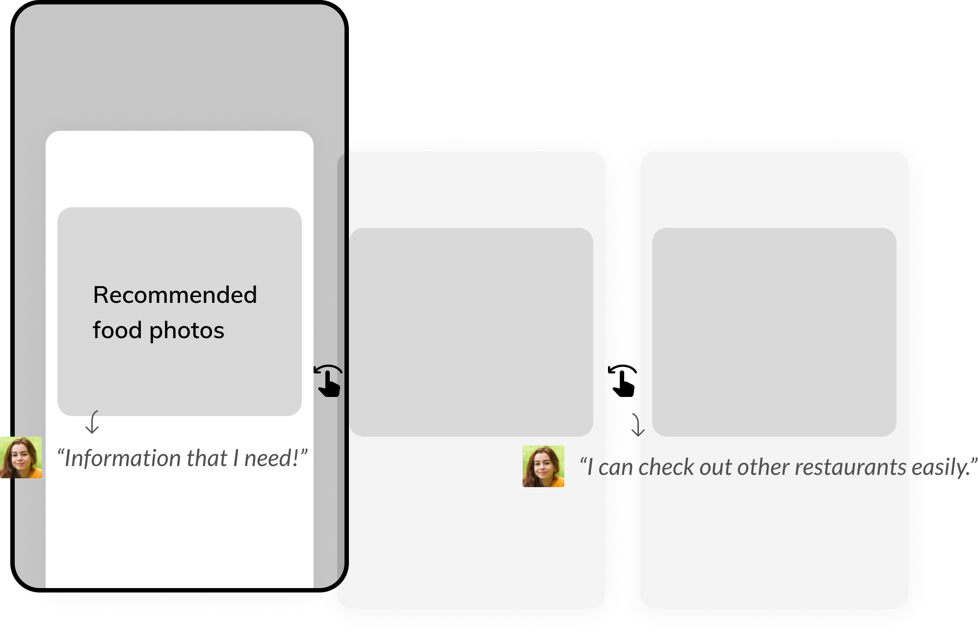
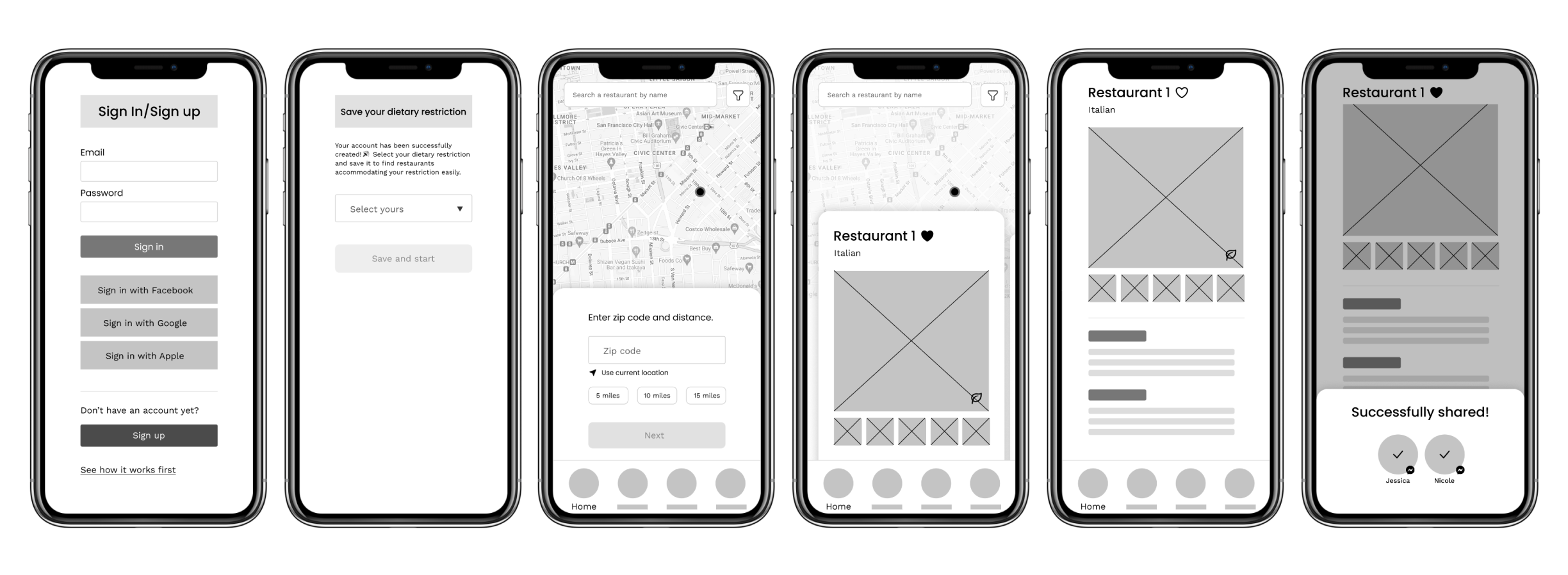
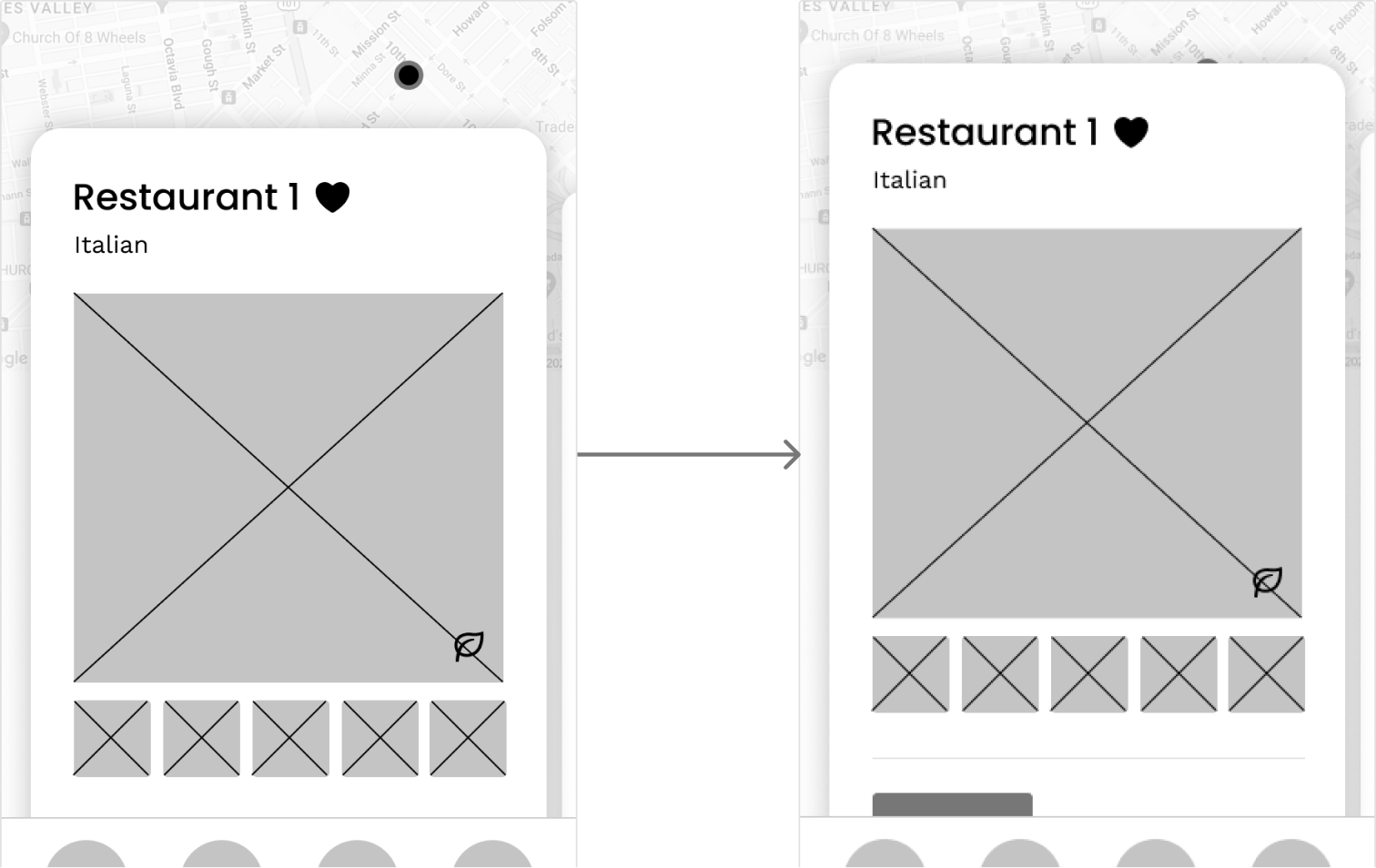
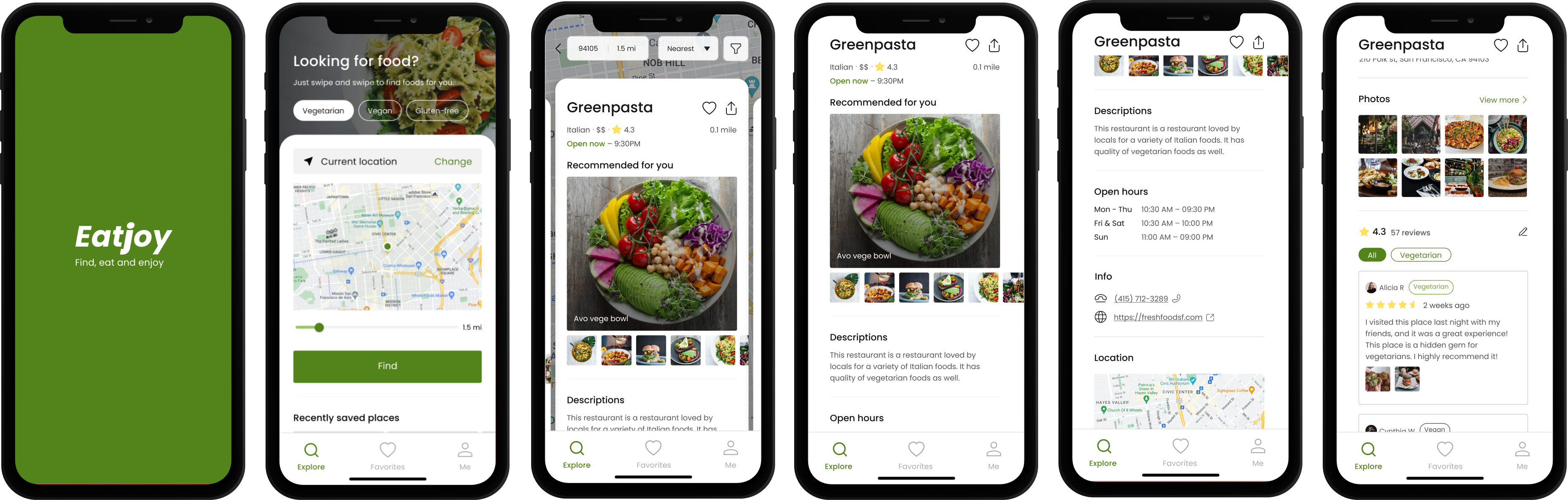
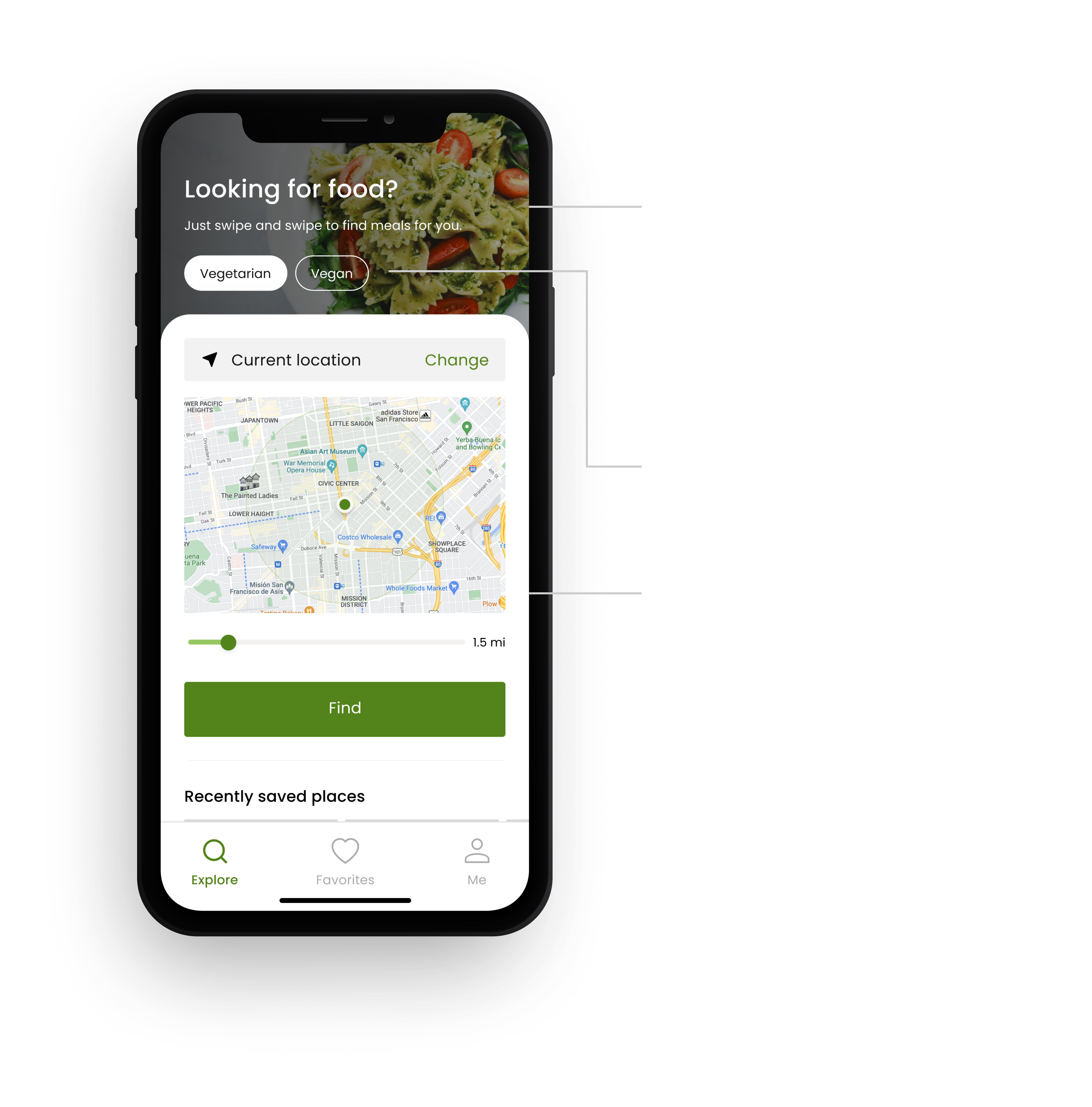
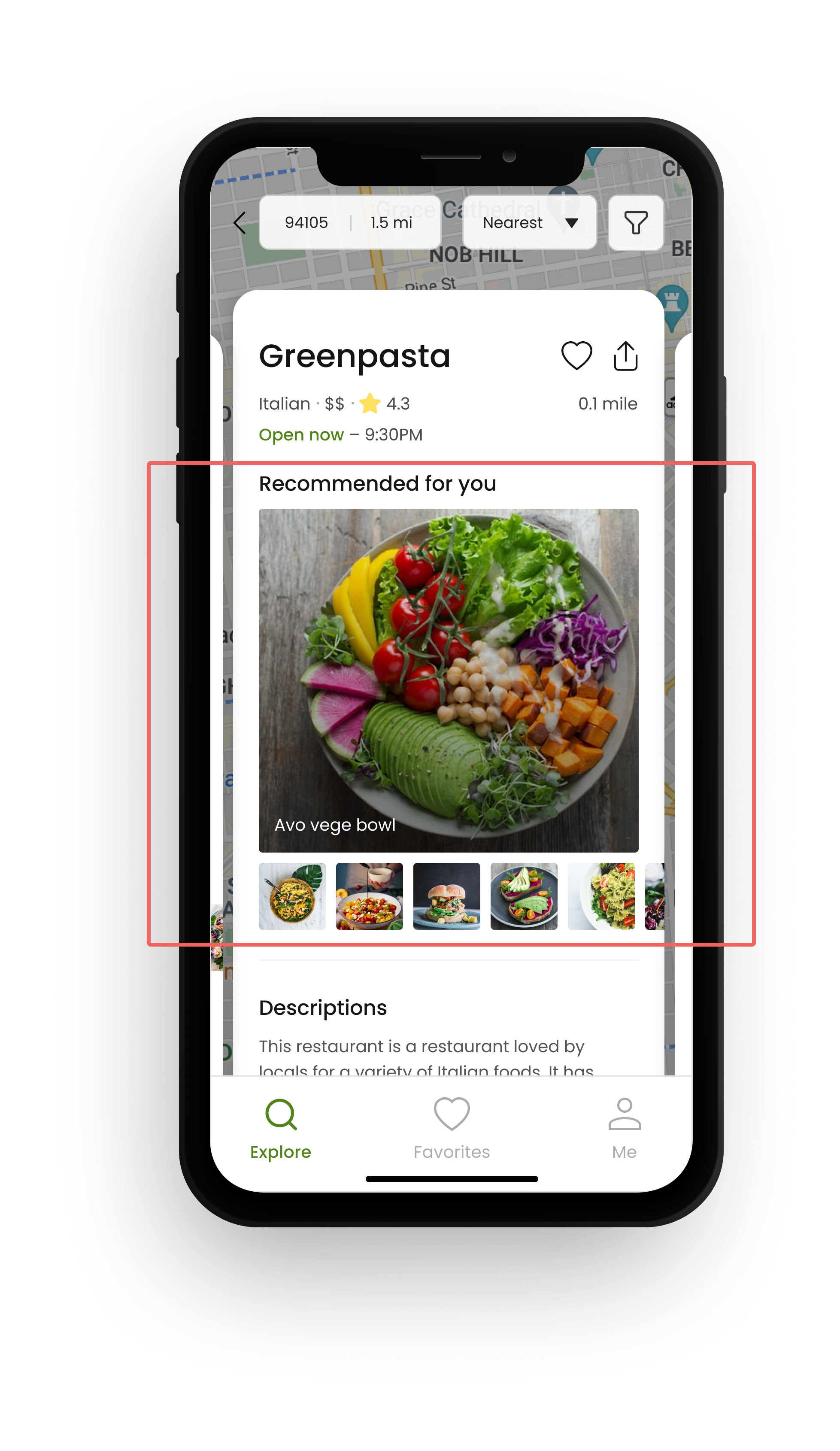
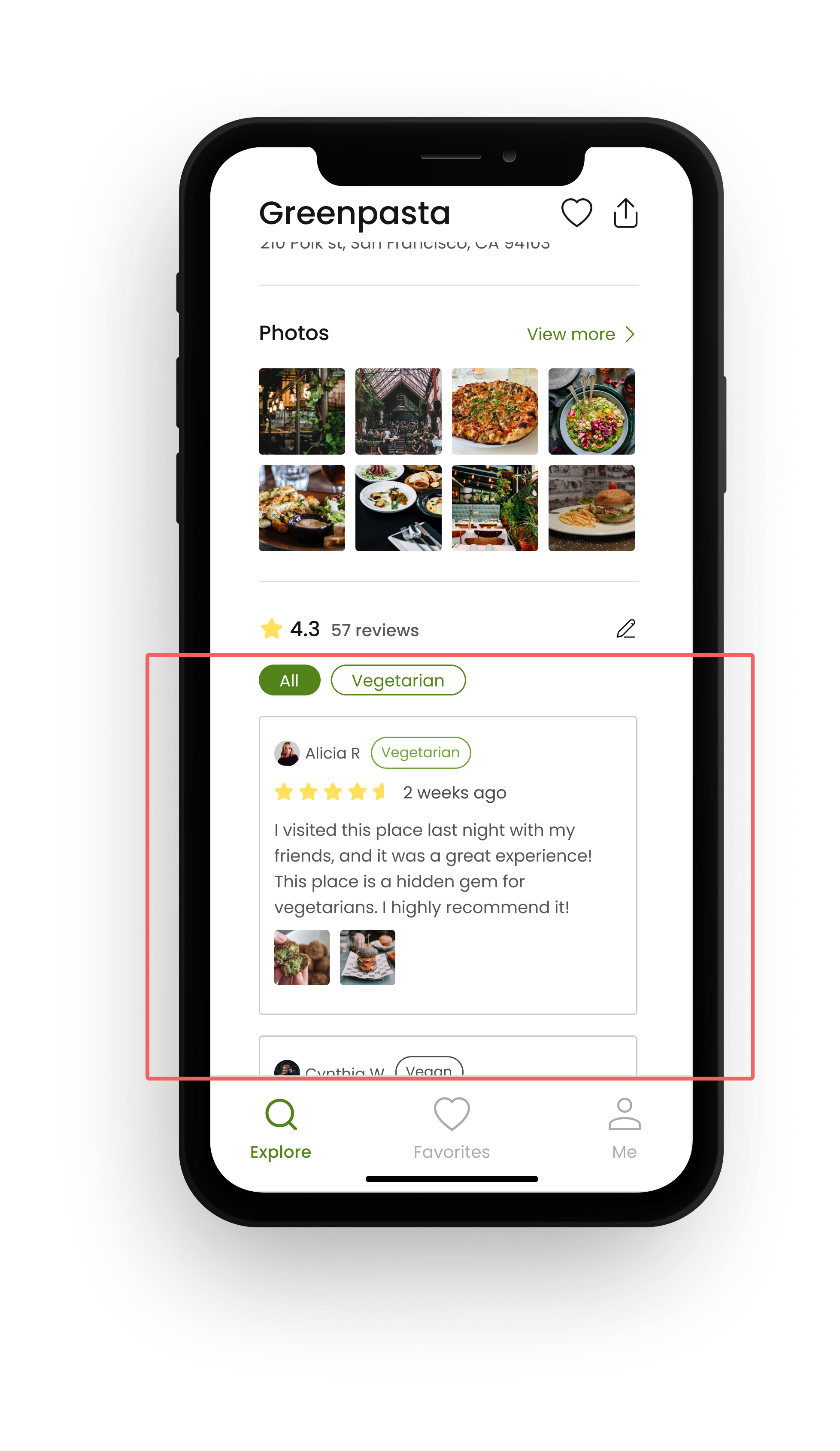
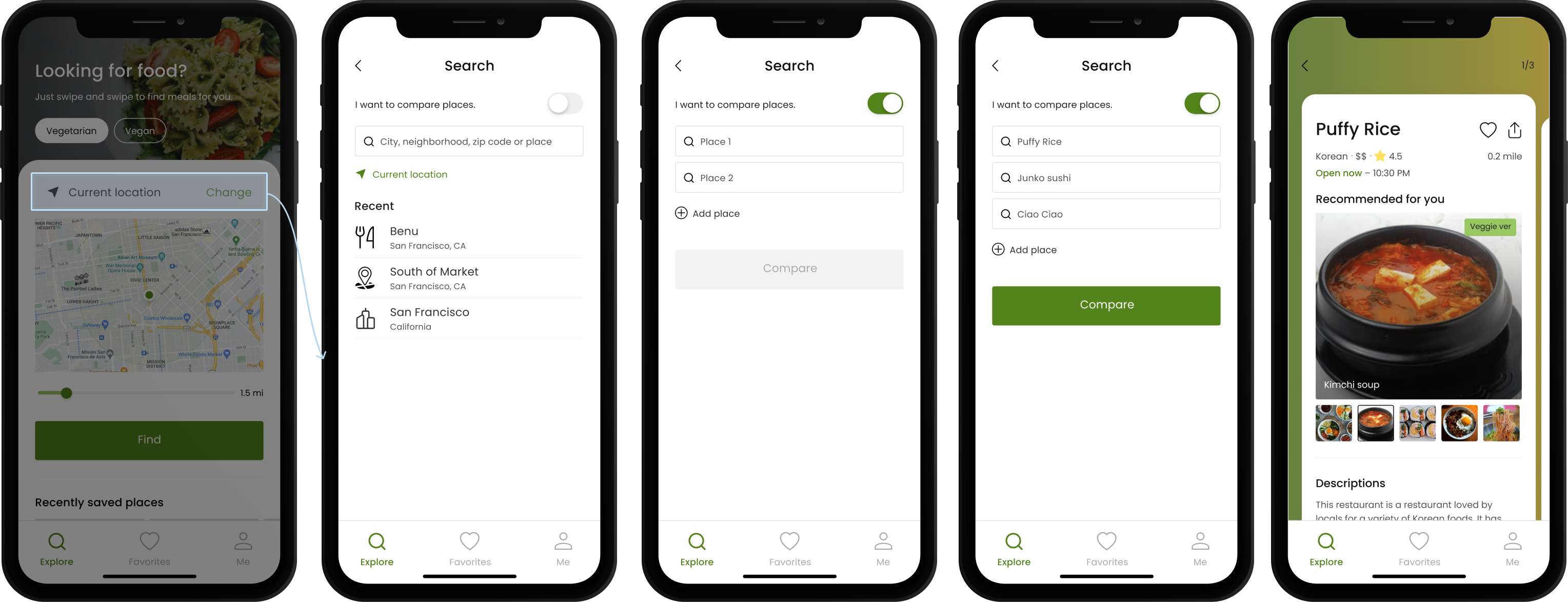
An easy-to-use food search app for Millennial plant-based foodies dining with non-restricted individuals
4 months
( Mar 2022 — Jun 2022 )
Research, UX/UI Design, prototyping and testing
Conceptual project
Dining out with dietary restrictions causes more stress and feelings of isolation when eating with non-restricted friends or family.
Achieving a Solution that Harmonizes the Needs of Diners, Companions, and Restaurants
My top priority was to focus on the needs of users with dietary restrictions, but I also had to consider the perspectives of their dining companions and restaurants because of the following reasons:
Thus, if the needs of users with dietary restrictions were not balanced with the perspectives of their dining companions and restaurants, it could lead to avoidance by either party. It was challenging but crucial to strike a balance between these factors to ensure their pleasant social dining experience.
To achieve the goal, it was important for me to understand and identify the perspectives of all parties involved through research while still prioritizing the needs of users with dietary restrictions.
Instead of targeting all with dietary restrictions, I narrowed down the target audience to maximize budget impact for this hypothetical early stage startup.
To identify areas of focus for interviews, I analyzed several relevant articles on dining experiences with dietary restrictions.
This led me to the following questions:
Considering the questions from the previous step, I aimed to find out:
With budget and time constraints, I conducted in-depth interviews with two potential users, one of whom was a vegetarian, and the other had a vegetarian family member.
It’s interesting that even though their dining companions may think they are too picky, they are often willing to help them find a restaurant that works for their dietary needs. Sometimes their companions give suggestions, or they let the diners choose a restaurant, to make sure everyone has a good time eating together.
After conducting interviews, it was found that target users’ needs were balanced with those of their family and friends, as long as they were open to non-vegetarian restaurants.
To gain further insights from restaurants’ perspective and identify ways to provide value for a viable product, two restaurant owners were interviewed. Surprisingly, one of them had a positive attitude towards diners with dietary restrictions, contrary to the initial assumption.
The interviews revealed that restaurant owners were interested in a platform that can assist them in:
Based on these findings, it was concluded that a search platform that helps users discover both vegetarian and modified food options would satisfy both parties’ needs. However, the challenge lies in differentiating the product from the plethora of existing restaurant search platforms.
As a result, I found that the map-based UI adopted by all platforms can be useful for the persona to locate nearby restaurants. However, I also identified the following areas for improvement:
“How might we help Olivia finding suitable food options easily?”
After conducting all the research, I established the HMW statement that reflects the opportunities uncovered through the competitive analysis and interviews.
During the ideation process, I was reminded of the fact that photos of vegetarian foods helped Olivia make restaurant decisions quickly, but the list-based UI made it difficult. Therefore, I made the following assumption:
“If Olivia has easy access to photos of restricted food options, it makes choosing a restaurant simpler and reduces the need for unwanted ingredient changes.”
In order to determine the specifics of the main concept, I had to determine:
To address these questions, I created three themes to guide the user journey, imagining what steps a user, named Olivia, would take to find a restaurant and make a selection using the app:
With a clear understanding of the elements and their organization, I then created wireframes for the app.
To validate the platform’s effectiveness, three crucial tasks were defined at meaningful touch points in the user journey to dine at a restaurant with friends:
Based on the results of the testing and the feedback received, I made improvements to my design to enhance the user experience and ensure task completion.
A tester was unsure they could swipe up to see more information, so more elements were made visible to indicate to users that they can see more information about the restaurant by swiping up.
The map was adopted to help users find restaurants based on their current location, but it was found to confuse users. To address this, the map was used only when necessary, assuming confusion was due to unclear role.A tester was unsure they could swipe up to see more information, so more elements were made visible to indicate to users that they can see more information about the restaurant by swiping up.
Following the refinement of the wireframes, I progressed to creating high-fidelity designs.
One day, Olivia and her friends decide to dine out and she opens Eatjoy.
In the past…
With large photos of vegetarian options displayed first, Olivia can quickly decide whether a dish appeals to her. If so, she can simply scroll down to access additional details about the restaurant.”
She can effortlessly move through the options, viewing other restaurants without having to switch back and forth between pages.
She’s interested in “Avo Vege Bowl” and “Green Bowtie Pasta!
In the past…
With Eatjoy, she can easily filter reviews with a simple click. She can see that other vegetarians like this restaurant. Now she wants to try this restaurant!
Excited to try the restaurant, she shares its information with her friends.
However……
What if Olivia’s friends send her a list of restaurants they’ve selected?
In this case, there’s a greater chance she’ll end up ordering something she doesn’t actually want since the options are more limited compared to when she gets to choose from a wider range of restaurants.
In the past…
Using this app, how can Olivia ensure she selects a restaurant from her friends’ list that will serve satisfying vegetarian options?
“I love that I can now have a meal that fits my dietary restrictions and preferences without having to ask the restaurant. The new menu has a good balance between healthy and satisfying options.”
In addition to benefiting diners, this app also provides value to restaurants.
With everyone involved now happy, it’s a win-win situation for all.
Conventional Design Elements May Not Be Ideal
The map UI was initially integrated, assuming it would be a standard and effective solution for helping users locate restaurants based on their location. However, the results of testing revealed that this common design element caused confusion for users. It highlights the importance of considering the main concept and features of a product when incorporating conventional design elements.